Let’s Explore How to Identify Bad Webpage Design and Avoid Common Pitfalls!
Every business deserves a website that conveys professionalism, clarity, and confidence. But all too often, “bad design” sneaks in and drags a site down—making it feel outdated, confusing, or even untrustworthy. Understanding how to spot weak design helps you make better decisions when hiring a designer, reviewing mockups, or giving feedback. Let’s break down three telltale signs that a webpage design needs a rethink.
1. Overloaded with Text
When a site looks like a giant block of copy stretched across the screen, visitors often feel overwhelmed before they even start reading.
What this looks like:
- Long paragraphs with no breaks
- Dense, unformatted walls of text
- Little visual breathing room (empty space)
- No clear hierarchy or emphasis
Why it’s a problem:
- People scan, not read—so they drift away
- Key messages get lost
- The page appears old or amateurish
How to fix it:
- Break content into bite-sized chunks
- Use headings, subheadings, bullet points, and whitespace
- Add visuals (photos, icons, illustrations) to support the text
- Highlight key phrases or calls to action
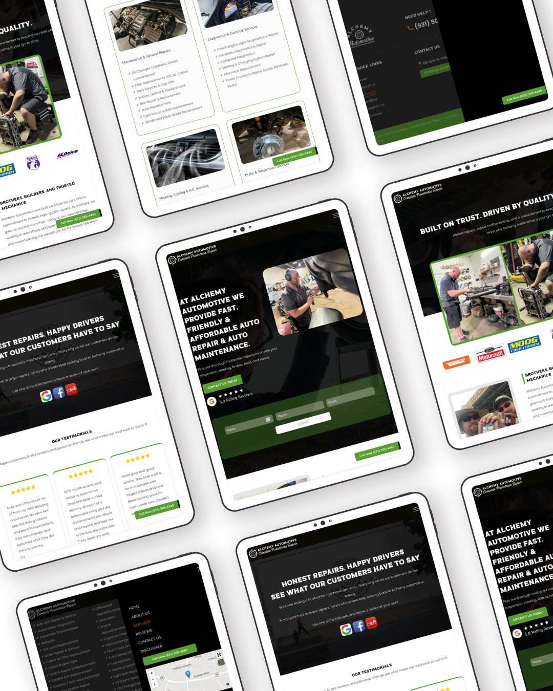
2. Non-Responsive Design
If a website looks perfect on a desktop but breaks or misaligns on tablets or phones, it’s failing a basic standard of web design.
What this looks like:
- Text that’s too small to read on mobile
- Buttons, links, or fields too close together
- Layouts that shift or overlap when resizing
- Horizontal scrolling required
Why it’s a problem:
- Mobile users may leave immediately
- Google penalizes non-responsive sites in search rankings
- Your audience includes smartphone users—if you ignore them, you lose them
How to fix it:
- Use responsive frameworks or themes
- Test your design on multiple screen sizes
- Prioritize mobile-first layouts (design for small screens first)
- Simplify navigation and features on mobile
3. Outdated Design Elements
A webpage that feels stuck in 2005 can undermine even the best branding. That “dated” feeling often comes from relics in the design that no longer serve your audience or aesthetics.
Examples of outdated elements:
- Overused clip art, gradients, or skeuomorphic graphics
- Excessive shadows, beveled edges, or glaring effects
- Comic-style fonts, excessive animations, or blinking banners
- Stock photos that look staged or cliché
Why it’s a problem:
- It erodes credibility
- It signals that the business might be behind the times
- It distracts from your real content or messaging
How to fix it:
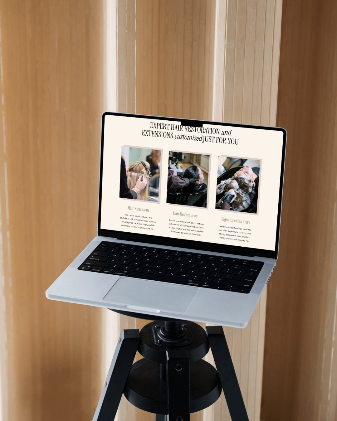
- Favor modern, flat design elements
- Use high-quality, authentic photography
- Minimize animations and transitions
- Refresh fonts, colors, and visual style periodically