When Ashley Fitz came to me wanting a logo that screamed “country club luxury” for her real estate business, I was so ready. She had this whole vision: plaid, high-end, sporty but sophisticated. The kind of brand that makes people think “this woman sells lakefront investment properties AND knows which fork to use at the club.”
But here’s the thing about learning how to make a memorable logo: it’s not just about making something pretty. It’s about making something that works, that lasts, and that actually helps you sell.
In this post, I’m pulling back the curtain on Ashley’s entire branding project. You’ll see the real process, the challenges we solved (hello, real estate naming regulations), and what actually makes a logo stick in people’s minds. Whether you’re hiring a designer or DIY-ing it, these principles apply.
Let’s dive in.

Meet Ashley: A Real Estate Agent Who Needed to Stand Out
Ashley and I go way back. We first met at a Women Connect event in Brentwood, and about a year later, I ended up starting the Spring Hill chapter with Ashley as my county leader. We worked really well together, and even after I stepped away from that role (because my business kind of exploded and I ran out of hours in the day), we stayed connected.
Fast forward to 2025, and Ashley reached out with the message every designer loves to hear: “I’m finally ready.”
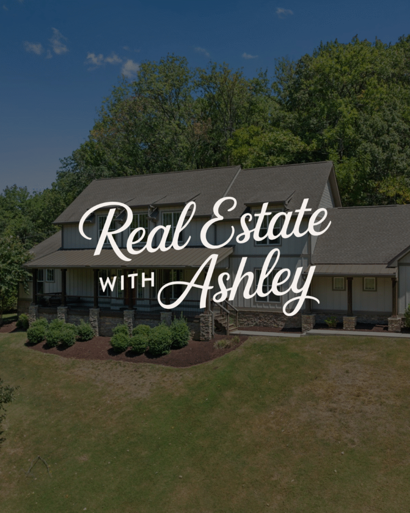
She’d been thinking about her brand for a while, but she knew exactly what she wanted. Country club aesthetic. Sporty but sophisticated. That high-net-worth, luxury vibe without feeling stuffy or unapproachable. Think navy blazers, plaid skirts, and a killer backhand at the tennis court. Totally fit her clothing style, too! Fun fact: I bought my first pair of Golden Gooses because of her. I figured if they were cool enough for Ashley, they were cool enough for me. Thanks for making me spend $650 on a pair of dirty shoes, friend! Haha
But here’s where it got interesting: Ashley works in real estate, which comes with some very specific naming regulations. Could she use an actual business name, or did it have to be her legal name? She was also thinking ahead to potentially building a team or even her own brokerage someday, so we had to consider longevity.
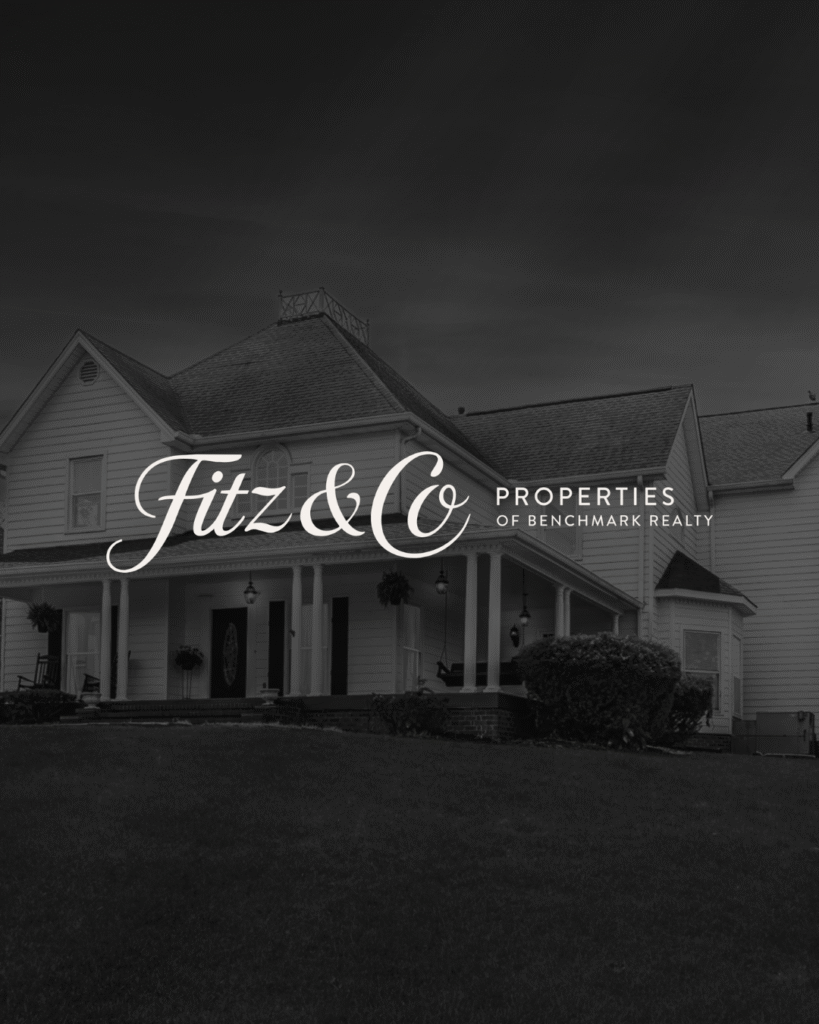
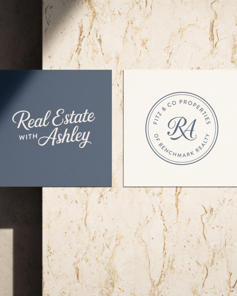
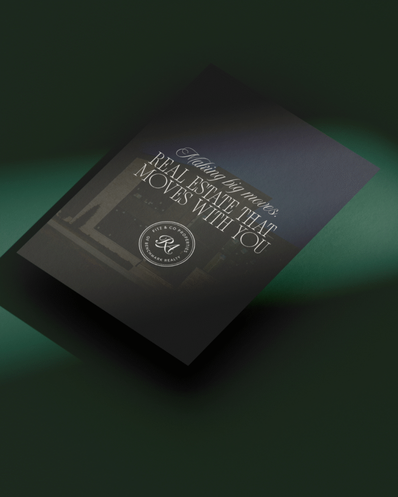
We explored a ton of options and eventually landed on two compliant names: Real Estate With Ashley and Fitz & Co. Properties. Both worked. Both gave her room to grow.
And honestly? This is why your logo needs to work THIS hard too. It’s not just about looking good. It’s about fitting your industry, your goals, and your actual life.
What Makes a Logo Memorable (And How We Applied It)
Okay, so every logo post on the internet is going to tell you about Nike’s swoosh and Apple’s bitten apple. I’m sorry. I’m doing it too. But also, they really did nail it, so let’s talk about why, and then let’s talk about what we actually did for Ashley.
It Tells a Story at a Glance
Ashley’s plaid wasn’t a random aesthetic choice. Plaid signals country club, tradition, old money, the kind of sophisticated leisure that comes with knowing how to properly score a golf game. The navy and green color palette? Sophisticated without being stuffy. Classic without feeling dated.
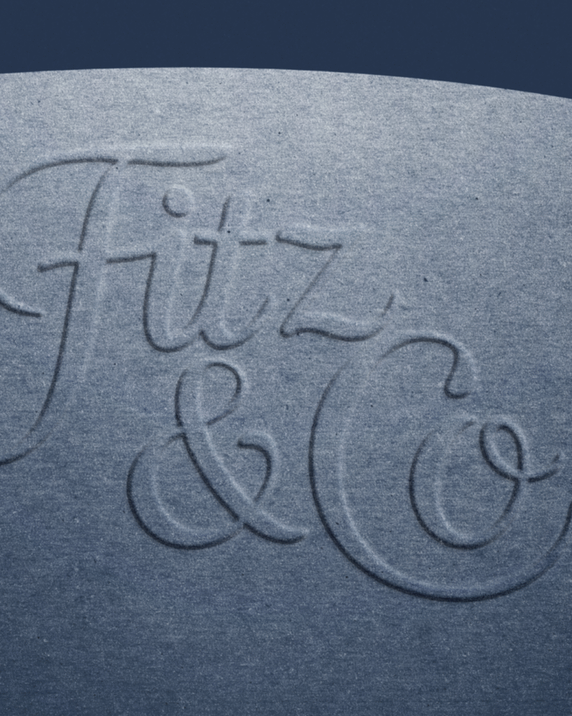
We paired it with a high-end script font that added this approachable elegance. It says “I’m successful and polished” without screaming “I’m too fancy to return your call.”
Here’s the key principle we applied: every single element should have a reason. If you can’t explain why you chose that color or that font or that little decorative swirl, cut it. Your logo isn’t a mood board. It’s a strategic business tool.
It’s Simple Enough to Remember
When Ashley came to me with “country club vibes,” we could have gone full maximalist. Tennis rackets! Golf clubs! Polo mallets! A tiny illustrated lakehouse! Monogrammed everything!
We didn’t do that.
Instead, we chose plaid as the hero and kept everything else clean. The script font, the organic illustrations, the overall aesthetic all support the plaid without competing with it.
Compare Ashley’s clean, plaid-forward design to the cluttered real estate logos you see everywhere. You know the ones. The house illustration crammed next to three different fonts, a tagline in illegible script, and someone’s headshot for good measure. It’s a lot. And nobody remembers it. MAJOR YIKES.
It Works Everywhere
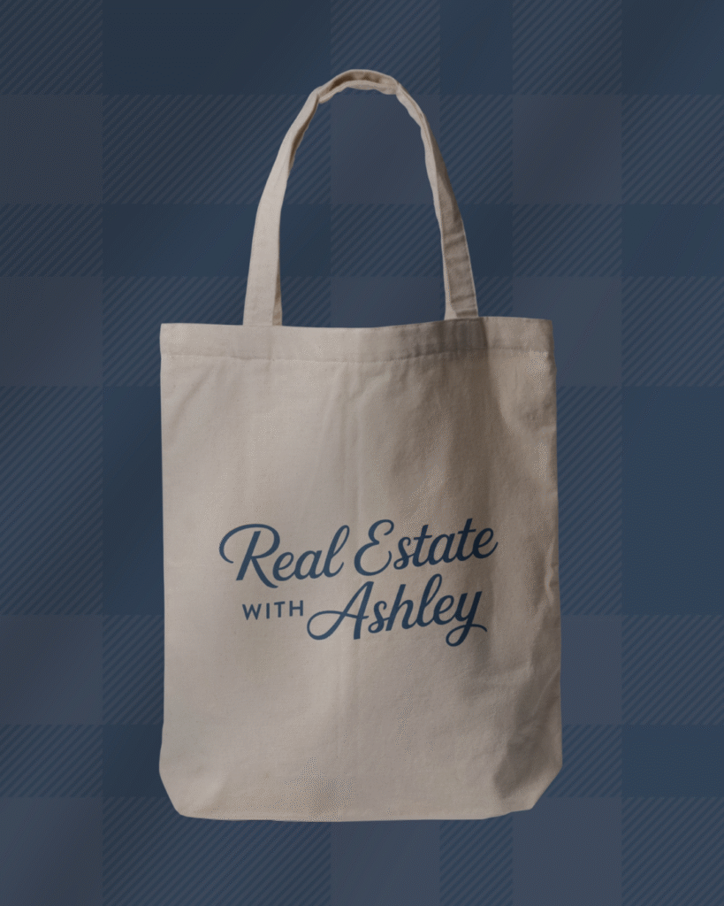
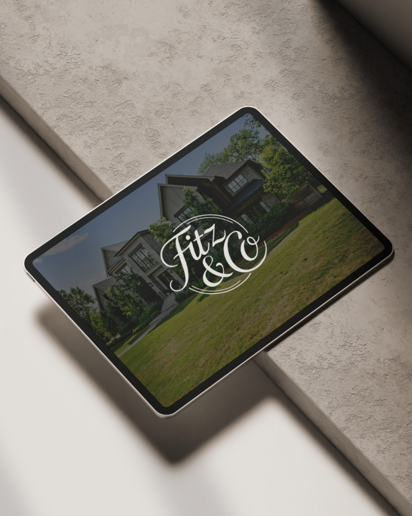
This is the part people forget when they’re designing logos on their laptops. Ashley doesn’t just use her logo on Instagram. She uses it on yard signs. Business cards. Custom branded merch (which, by the way, is so cool). Signage. Email signatures.
The test for any logo: Does it look good tiny on a business card AND huge on a billboard?
Ashley’s does. The plaid scales beautifully. The script font stays readable. The navy and green work in full color or simplified to one color when needed.
If your logo only works in one specific size or format, it’s not actually working for your business. And that’s a problem you’ll discover real quick when you try to put it on anything other than your website header.
See how we’ve helped other service-based businesses.

The Process: From “I Want Country Club Vibes” to Actual Logo
So here’s what working with a designer actually looks like, because I think this is the part people wonder about most.
We started with inspiration boards. Ashley sent me examples of brands she loved, patterns that caught her eye, and a whole lot of plaid screenshots. I could immediately see the vision: elevated, sporty, classic, but still approachable and fun.
Then we tackled the naming situation. This took some back and forth because real estate regulations are no joke. We explored different options, researched what was compliant, and thought through what would work if she eventually wanted to build a team or her own brokerage. Compliance is real, y’all. And it matters.
We refined based on her feedback, tweaked details, and eventually delivered her complete brand suite: multiple logo variations (primary, secondary, submark), the full color palette, font pairings, the plaid pattern, and organic illustrations she could use across her marketing. What goes into a complete brand identity.
Custom branding projects like this typically take 4-6 weeks from start to finish. It’s not a quick process, but it’s a thorough one. And the result? A brand that actually reflects who Ashley is and what she does, not just something that “looks nice.”
This is what strategic design looks like. It’s collaborative, it’s intentional, and it solves real business problems while also being beautiful.
Common Logo Mistakes (That We Avoided)
Let me tell you about all the things we could have done wrong with Ashley’s brand, because honestly? These mistakes are everywhere.
Following trends too closely. Yes, the country club aesthetic is having a moment right now. Plaid is everywhere, tennis core is trending, preppy is back. But we didn’t design Ashley’s logo to be trendy. We designed it to be timeless. The plaid we chose is rooted in classic patterns, not just whatever’s popular on Pinterest this week. In five years, when the aesthetic pendulum swings somewhere else, her brand will still look intentional and polished, not dated.
Too many ideas in one logo. We picked plaid as our hero element and committed to it. We didn’t also throw in tennis rackets and golf clubs and a monogram and her headshot. (Please, for the love of good design, stop putting headshots in logos.) One strong idea beats seventeen mediocre ones every single time.
Forgetting where it’ll actually be used. Ashley needed a logo that works on yard signs in someone’s front lawn, not just beautifully curated Instagram posts. So we made sure it was readable from a distance, recognizable at a glance, and versatile enough to work in full color or simplified down to one or two colors when needed. If your logo only looks good in one specific context, it’s going to cause you problems real fast.
Ignoring industry context. Real estate has specific needs. You need to convey professionalism, trustworthiness, and approachability all at once. You’re asking people to make massive financial decisions with you. A logo that works for a boutique bakery might not work for a luxury real estate agent, and that’s okay! Ashley’s brand needed to say “I know what I’m doing, I run in sophisticated circles, and I will absolutely help you find your dream lakefront property.” It does that.
“But What If I Can’t Afford Custom Branding?”
Look, I get it. Custom branding is an investment, and not everyone is at the place in their business where that makes sense yet.
Here’s the honest truth: Ashley was ready for custom because she had a super specific vision (country club plaid luxury), she knew where her business was headed (potentially building a team or brokerage), and she needed something totally unique to her. Custom made sense.
But if you’re just starting out, bootstrapping, or you’re not quite sure what direction you want to go yet? You have options.
We offer semi-custom brands specifically for this reason. These are professionally designed brand identities (think Poppy & Co., Abalone & Co., Sage & Cedar, and others) that you can customize with your business name and details. They’re strategically built, they look polished, and they cost a fraction of full custom. It’s a smart middle ground.
And if you’re going full DIY? That’s valid too. Just apply these same principles we used for Ashley. Pick one strong concept. Keep it simple. Make sure it works at different sizes. Think about where you’ll actually use it. Don’t try to cram every idea you’ve ever had into one logo.
There’s no shame in starting with something more accessible and upgrading later when your business grows. Ashley didn’t always have a custom brand. But when she was ready, she invested in it. That’s the path for a lot of successful businesses, and it’s totally okay.
FAQs About Creating a Memorable Logo
Custom branding projects like Ashley’s typically take 4-6 weeks from start to finish. That includes the strategy session, concept development, revisions, and final delivery of all your brand assets.
Semi-custom brands move faster, usually 2-3 weeks, because we’re working from an existing design framework and customizing it for you.
The timeline also depends on how quickly you can make decisions and provide feedback. The faster you can say “yes, that’s it” or “no, try this instead,” the faster we move.
Honest answer? It depends on your vision, your budget, and your design skills.
If you have a really specific aesthetic in mind (like Ashley’s country club vibe) and you want something totally unique to you, a designer is going to save you time, frustration, and probably money in the long run. We know how to take “I want it to feel expensive but approachable” and turn that into actual visual design.
If you’re just starting out and need something professional to get going, semi-custom brands or DIY tools can absolutely work. Just be intentional about it. Apply the principles we talked about. Don’t just slap a template together and call it done.
Timeless logos are based on classic design principles, not fleeting aesthetics. They can nod to current trends without being consumed by them.
Ashley’s plaid is a great example. Yes, country club aesthetic is trendy right now. But the plaid pattern we chose is rooted in traditional design, the color palette is classic navy and green, and the overall approach is sophisticated, not gimmicky.
The test I use: Will this still look intentional and polished in five years? If the answer is “only if that specific trend is still popular,” you’ve gone too trendy.
Design for longevity, not just for right now.
Conclusion
Ashley’s logo works because it’s strategic, not just pretty. The plaid tells a story. The colors convey sophistication. The simplicity makes it memorable. Every single element has a purpose.
And that’s really what separates logos that stick from logos that get forgotten.
Whether you’re ready for custom branding, exploring semi-custom options, or DIYing it with intention, these principles apply. Tell a clear story. Keep it simple. Make sure it works everywhere you’ll actually use it. And design for five years from now, not just today.
Ready to create your own memorable logo? Let’s make it happen.