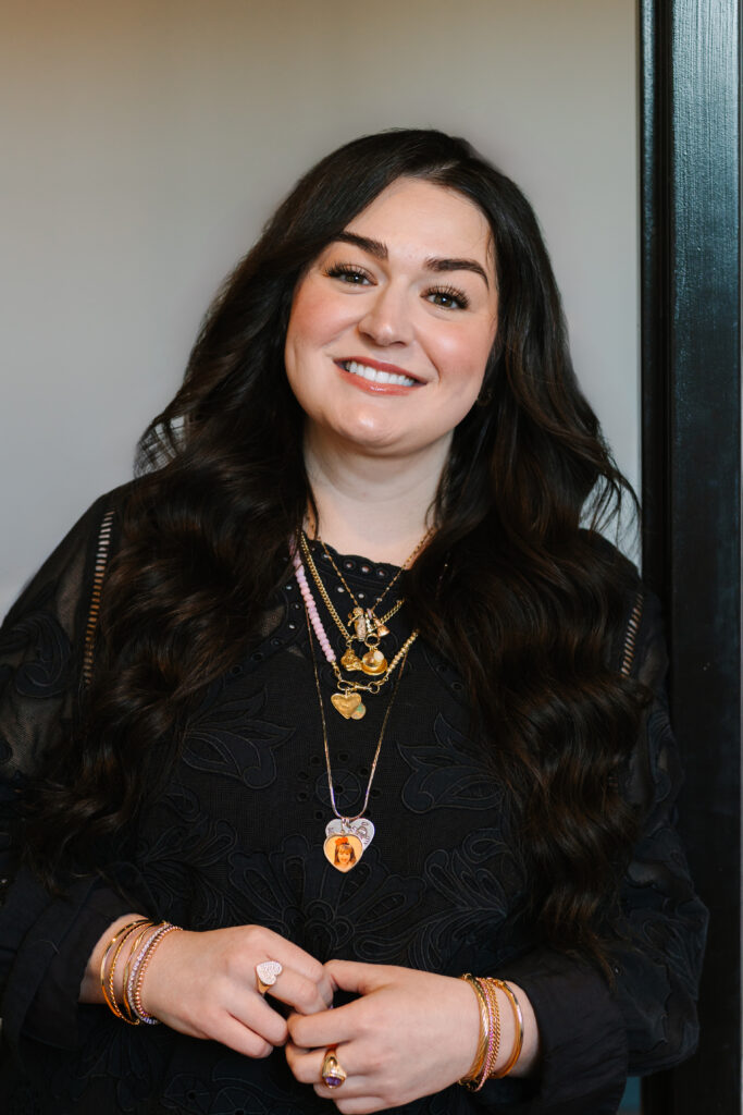
I wear a heart-shaped pendant with a photo of me as a little kid. On the back, it says “I love you mommy.” It was a gift from my dad and me to my mom when I was about four or five, and I’m wearing a giant bow in it. This necklace starts conversations at every single networking event I attend.
But here’s what most people don’t realize: it’s not just about having a conversation starter. It’s about showing up in colors that make you confident, memorable, and aligned with your brand.
When I worked in cosmetics, customers would walk up to me constantly and comment on my jewelry. We’d start talking, and suddenly no one felt sold to. That’s the power of showing up intentionally, and color plays a huge role in that.
By the end of this post, you’ll understand what colors mean emotionally and how to use that knowledge when YOU show up at events, on Zoom calls, or anywhere you’re the face of your business.
What Are Colors and Emotional Meaning?
Colors and emotional meaning is basically this: colors evoke specific emotions and reactions, both consciously and unconsciously. Research shows that 90% of first impressions are influenced by color alone. That’s huge.
This isn’t just about logos and websites. It’s about how you present yourself in person.
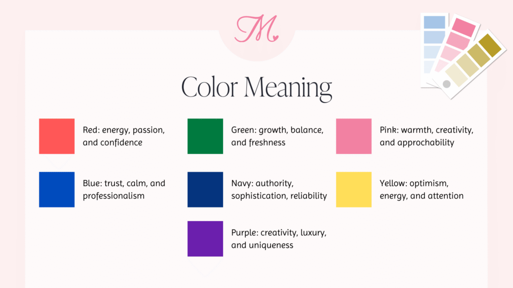
Here’s a quick breakdown of what different colors communicate:
Red conveys energy, passion, and confidence. It’s bold and attention-grabbing, but it can also signal urgency or intensity.
Blue represents trust, calm, and professionalism. It’s approachable and stable, which is why so many corporate brands use it.
Pink (my personal favorite) communicates warmth, creativity, and approachability. It’s playful and feminine without being overly soft.
Green signals growth, balance, and freshness. It’s calming and often associated with wellness or sustainability.
Navy conveys authority, sophistication, and reliability. It’s professional without being as harsh as black.
Yellow represents optimism, energy, and attention. It’s cheerful and hard to ignore, but too much can feel overwhelming.
Purple communicates creativity, luxury, and uniqueness. It’s memorable and often signals originality.
Now, let’s talk about why this matters when you’re showing up at networking events, getting on stages, or even hopping on Zoom calls.
Why Colors and Emotional Meaning Matter at Networking Events
First Impressions Happen in Seconds
You have about seven seconds to make a first impression. That’s it. And what you wear communicates before you even open your mouth.
Colors signal things like: Are you approachable? Confident? Creative? Professional? Trustworthy?
Think about it. Someone wearing bright pink at a Women Connect event gives off a completely different energy than someone in all black. Neither is wrong, but they’re sending different messages. Pink says “I’m friendly, let’s chat!” Black says “I’m sophisticated and serious.”
Both can work depending on your brand and your industry, but you need to be intentional about it.
Memorability Is Everything
Networking isn’t just about meeting people. It’s about being REMEMBERED after the event is over.
When you wear your brand colors consistently, people start to associate those colors with you. I show up in pinks and navy constantly. People recognize me across the room before they even see my face. That’s the power of color consistency.
The goal isn’t just to hand out business cards. It’s for someone to see your color palette later and immediately think of YOU.
Confidence Comes from Alignment
Here’s the thing: when your outfit matches your brand AND looks good on you, you show up differently. You’re not second-guessing your appearance. You’re focused on making connections and having real conversations.
Wearing colors that flatter your skin tone, hair, and features gives you an instant confidence boost. And that confidence is magnetic.
This matters especially for solopreneurs and service providers who ARE the face of their business. You’re not just a logo. You’re a person, and people connect with people.
How to Choose YOUR Networking Colors
Start with Your Brand (If You Have One)
If you already have a brand, start there. What are your brand colors?
More importantly: Are they colors you actually look good in?
If not, we need to talk. Because here’s my philosophy: when I design brands for clients, I make sure the colors work for their industry AND look amazing on them. You’re going to wear these colors in photoshoots, on stages, at networking events. They need to flatter you, not work against you.
Consider What You Look Good In
Skin tone matters. Cool-toned people look best in colors with blue or purple undertones. Warm-toned people look best in colors with yellow or golden undertones.
My brand colors include Barbie pink, soft peach, deep navy, olive, and an off-black. I look good in cool-toned pinks even when I’m pale, or when I’m rocking a crusty fake tan (which, let’s be honest, happens). I also look surprisingly good in black and olive, so those are part of my palette too.
If you don’t have a brand yet, start with colors that make you feel confident and that people compliment you on. Pay attention to that feedback. When someone says “That color looks amazing on you,” that’s data.
Think About Your Industry
Different industries have different color expectations, and it’s smart to be aware of them.
Finance, law, or corporate consulting? Navy, gray, and black signal trust and authority.
Creative fields like design, photography, or coaching? You have way more flexibility. Bolder colors work beautifully and help you stand out.
Wellness, therapy, or holistic health? Soft tones, greens, and blues convey calm and approachability.
Catering, hospitality, or event planning? Warm, inviting colors make sense.
When I designed Jamie Rose Plum’s catering brand, we used French-inspired watercolor tones that worked for her industry AND looked beautiful on her when she shows up to events. It’s strategic on multiple levels.
Test It Out
Wear your brand colors to your next networking event and pay attention. Do you feel confident? Do people comment on your outfit? Do you stand out in the group photos people post on social media later?
If something feels off, adjust. Your brand should make you feel like the best version of yourself, not like you’re wearing a costume.
Real Client Examples: Colors That Work
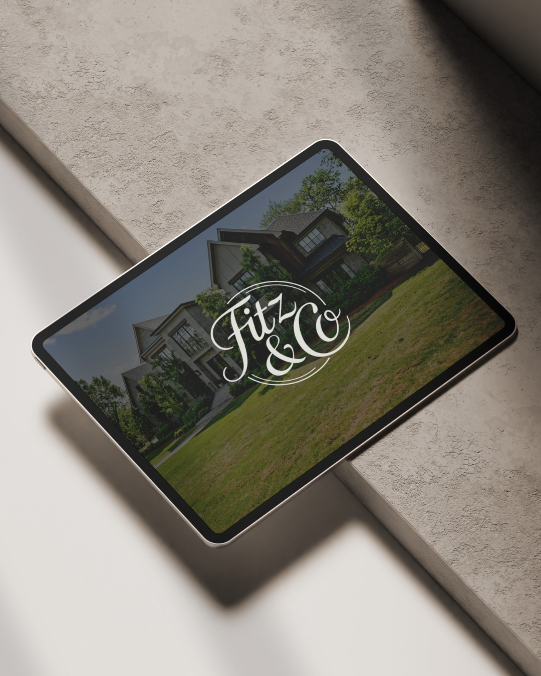
Ashley Fitz (Real Estate Agent)
Ashley needed a brand that communicated “country club luxury” for her work in investment and commercial real estate. We landed on navy, green, and plaid accents.
Why it works: Navy and green feel sophisticated and trustworthy, perfect for luxury real estate. The plaid adds a touch of traditional elegance without being stuffy.
The bonus? These colors look incredible on her. When she’s networking, posting on social media, or meeting with clients, she looks polished and completely on-brand. She’s instantly recognizable, and that builds trust.
Jamie Rose Plum (Catering)
Jamie runs a catering business with French-inspired vibes. She already had a watercolor logo she loved, so we built a brand around it using soft, elegant watercolor tones.
Why it works: The colors reflect the artistry of her food. They feel upscale but still approachable and warm, which is exactly the vibe she wants for her clients.
The bonus? She looks amazing in these colors. When she shows up to events or does tastings, she embodies her brand effortlessly.
Erica Millard (Bookkeeping)
Erica needed a brand that felt professional but not intimidating. Bookkeeping can feel stuffy, and she wanted to stand out as approachable and modern.
We chose tones that photograph well and look confident on stage, because Erica speaks at events regularly.
Why it works: The colors position her as professional and trustworthy without being boring. She stands out in a sea of boring accountant brands.
The bonus? When she’s on stage or at networking events, she looks like her brand. There’s total alignment.
In all three cases, we designed brands that work for their industry AND make them look good. Because when you’re an owner-operator in the early years of your business, showing up confidently is way more important than theoretical color psychology.
Beyond Colors: Other Ways to Be Memorable
The Power of a Signature Piece
Remember my heart pendant? That’s a signature piece. It’s a conversation starter, and people comment on it constantly.
If you’re awkward about starting conversations at networking events, find a piece of jewelry or an accessory that invites people to approach you. A unique necklace, an interesting ring, a bold scarf. Something.
People WILL walk up and comment. It’s an instant icebreaker, and suddenly you’re in a real conversation instead of doing the “so, what do you do?” small talk dance.
Consistency Across All Touchpoints
Don’t just think about in-person events. Think about every place you show up:
In-person events: What you wear
Virtual events: Your Zoom background and what you wear on camera
Social media: Brand photos, graphics, even the colors in your content
Marketing materials: Business cards, name tags, slide decks
The more consistent you are across all these touchpoints, the more memorable you become. People start to recognize your visual identity before they even remember your name.
Common Questions About Colors and Networking
What if my brand colors don’t look good on me?
This is actually a sign you need to rethink your brand colors. I know that sounds harsh, but your brand should work FOR you, not against you.
Especially in the early years when you ARE the face of your business, you can’t afford to show up in colors that make you look washed out or uncomfortable.
If this is you, let’s talk about a brand refresh. It’s not a failure. It’s strategic.
Do I have to wear my brand colors to EVERY event?
No, but consistency helps with memorability.
Aim for incorporating at least one brand color into your outfit. Even if it’s just accessories like a scarf, jewelry, or shoes. Small touches add up and reinforce your brand without making you feel like you’re wearing a uniform.
What if I’m in an industry where I have to wear a uniform or logo shirt?
This advice is primarily for service providers, coaches, consultants, and creatives who have flexibility in what they wear.
If you’re wearing a uniform (like tradesmen or certain retail workers), focus on other brand touchpoints instead: business cards, marketing materials, your social media presence, and how you show up online.
Ready to Show Up Confidently?
Colors and emotional meaning aren’t just theory. They affect how people perceive you, remember you, and connect with you at networking events and beyond.
When your brand colors actually look good on you, you show up with more confidence and presence. And confidence is magnetic.
This is exactly why I design brands strategically. Your colors should work for your industry AND make you look amazing. Both things matter.
Want help figuring out your networking strategy? Download the Networking Sparkle Kit for conversation starters, outfit planning tips, and confidence boosters.
Or if you’re ready to design (or redesign) a brand that actually works for you, let’s talk about custom brand design. We’ll create colors that represent your business and make you look incredible.
Next time you’re getting ready for a networking event, think about what your colors are saying about you. And if you’re wearing something that doesn’t feel like YOU? That’s a sign it’s time for a brand refresh.
See you at the next event, probably wearing pink. 🤍