Hey hey, friend! If you’ve been thinking about your website lately — whether that means finally building one, fixing the one you have, or just staring at it going “something is off but I don’t know what” — you are in the right place.
I’m Makena, your go-to for all things brand and website design, and I have spent years helping women entrepreneurs build websites that actually do something. Not just sit there looking pretty (although we love pretty around here!), but genuinely work for their businesses day in and day out.
So let’s talk about what web design for female entrepreneurs actually needs. No jargon, no overwhelm, just the real stuff.
First Things First: Your Website Is Not a Brochure
I know, I know. Stay with me here!
A brochure is something you hand someone and hope for the best. Your website? It should be a 24/7 sales tool that’s out there doing the heavy lifting even when you’re off living your life, hanging out with your dog, or finally taking that vacation you’ve been putting off since 2022.
The difference between a website that closes clients and one that just… exists… almost never comes down to how pretty it is. It comes down to strategy. Does your site tell the right person, immediately, that she’s found exactly what she’s been looking for? Does it make her feel understood before she’s even scrolled? Does it give her a clear, easy path to work with you?
If yes, amazing, you’re already ahead of the game! If not, that’s exactly what we’re going to dig into today.
What Web Design for Female Entrepreneurs Actually Needs
Let’s break it down into the pieces that actually move the needle. These aren’t just design opinions — these are the things I’ve seen make a real difference for women-owned businesses time and time again.
Clear, Specific Messaging (This One Is Big, Friend)
Here’s something I see constantly: a website that looks absolutely beautiful but has copy so vague that a visitor has no idea what the business actually does.
“I help women create lives they love” is a lovely sentiment. It is not a business description. (No shade — I see this everywhere and it breaks my heart a little every time!)
Your homepage needs to answer three questions fast: What do you do? Who do you do it for? What should I do next? The clearer those answers are, the more likely a potential client is to stick around and actually book with you.
And here’s the thing about specificity — it doesn’t make you sound less warm or less human. It actually does the opposite. When someone lands on your page and immediately thinks “oh wow, she’s talking directly to me,” that feeling of being understood? That’s what converts browsers into buyers.
Try this little test: read your homepage out loud to someone who has never heard of your business. Can they explain back to you what you do and who you help? If they look at you blankly or give you a very general answer, your messaging needs some work. This is one of the most common things I help clients fix, and the results are always so exciting to see! If you want to dig deeper into messaging, check out our post on strong branding for business growth.
Design That Builds Trust Before You Say a Word
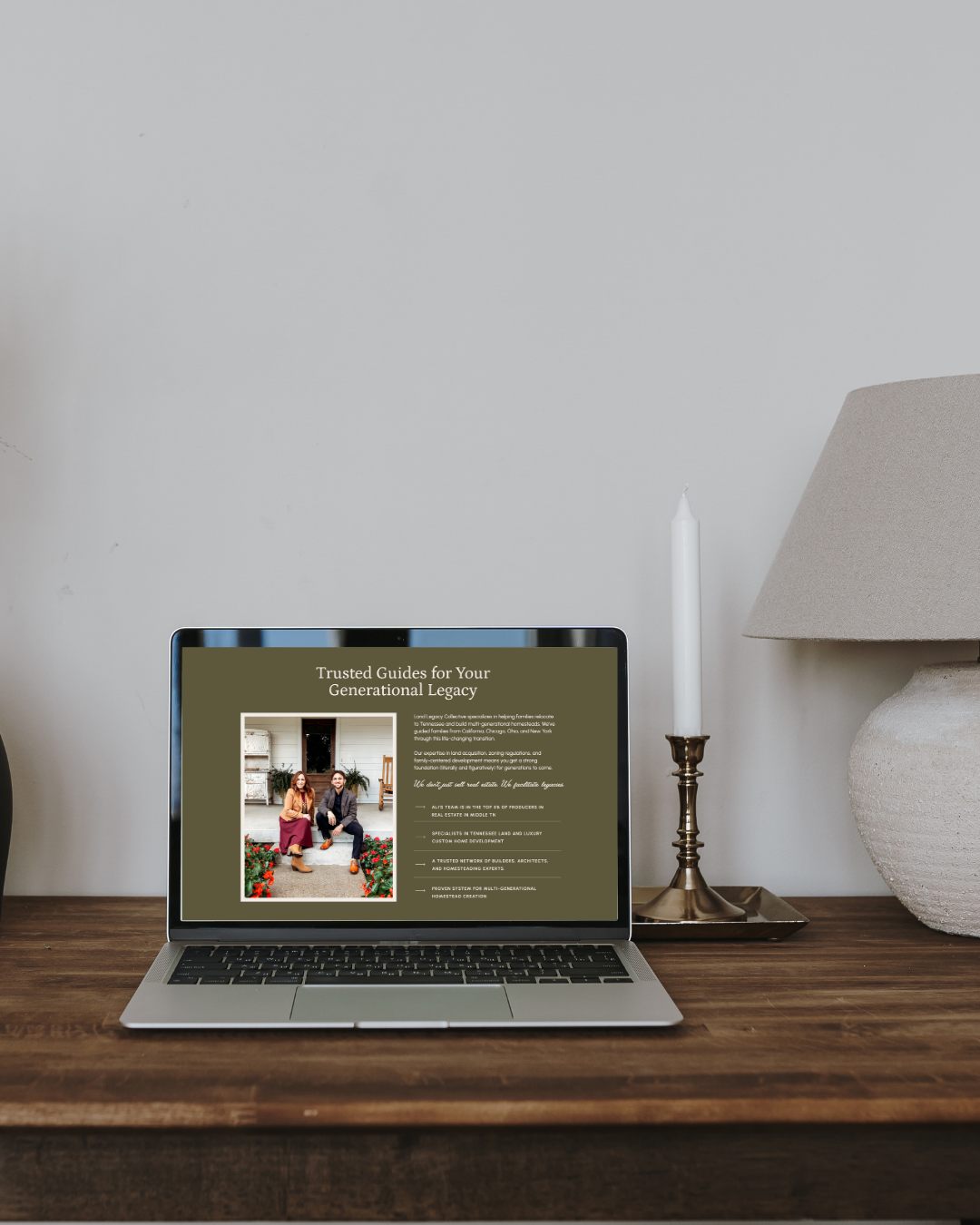
Your visual identity is doing a lot of talking before your copy even gets the chance. A cohesive, professional brand, consistent fonts, a color palette that actually makes sense together, a logo that doesn’t look like it was made at 11pm on a free design app, tells people you take your business seriously.
And for women-owned service businesses especially, that credibility signal matters enormously. We are already fighting harder than we should have to in order to be taken seriously. Your design shouldn’t be making that harder.
Think about the last time you landed on a website and immediately felt like “yes, this person knows what she’s doing.” What did that feel like? Probably pretty great, right? That feeling doesn’t come from luck. It comes from intentional, strategic design that signals professionalism at a glance.
Now think about the last time you landed on a website and something just felt… off. Maybe the fonts were all over the place. Maybe the colors were giving 2012 energy. Maybe the logo looked a little rough. Did you stick around? Probably not as long as you would have otherwise.
Your potential clients are doing the exact same thing when they land on your site. Your design is your first impression, and in the online world, first impressions happen really fast. Want to learn more about what goes into a professional brand identity? We break it all down in The Anatomy of a Perfect Brand.
A Clear Path to Booking (Just One, Please!)
Okay, this is my personal soapbox moment so bear with me because I feel strongly about this one!
When someone lands on your website ready to take action, please, for the love of all things good and right in this world, give her ONE clear next step. Not five options. Not a pop-up AND a freebie AND a booking link AND a newsletter signup AND a quiz all competing for attention at the same time.
One. Next. Step.
Book a call. Send a message. Shop now. Download the freebie. Whatever makes the most sense for your specific business, just pick one and make it obvious on every single page.
Here’s why this matters so much: there’s actually a psychological concept called decision fatigue, and it is very real. The more choices you give someone, the harder it becomes to choose any of them. What feels like offering your visitor more options is actually making it less likely she’ll take any action at all.
So simplify! Give her one clear path forward and watch what happens to your inquiry rate. I’ve seen this single change make a noticeable difference for clients, and it costs exactly nothing to fix. For more quick wins like this one, check out our 5 simple website tips to boost engagement.
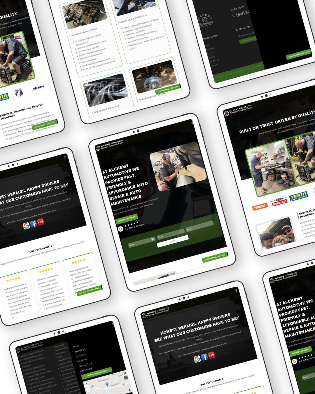
Mobile Optimization That Actually Works
Real talk: more than half of all web traffic happens on a phone. More than half! So if your website looks absolutely gorgeous on a desktop but completely falls apart on mobile, you are losing clients every single day and you might not even realize it’s happening.
Here’s what I want you to do right now (yes, right now, I’ll wait!): pull up your website on your phone. Read it like you’ve never seen it before. Ask yourself honestly, is it easy to navigate? Does the text size make sense without having to zoom in? Can you find the contact button without squinting or accidentally tapping three other things first? Does the layout look intentional or does it look like everything just got stacked on top of each other?
If the answer is “yikes” to any of those questions, add mobile optimization to your fix list immediately. This is non-negotiable in 2025 and beyond. Our post on essential homepage elements has even more must-haves to check off while you’re at it!
SEO So the Right People Can Actually Find You
Okay, I know SEO sounds scary and technical and like something that requires a whole other degree to understand. I promise it doesn’t! (Or at least, the basics don’t.)
A beautiful website that nobody finds is a very expensive diary. (I say this with love because I have watched it happen and it is genuinely heartbreaking!) You can have the most stunning, perfectly crafted website in your industry and if it’s not optimized for search, it’s basically invisible to everyone who doesn’t already know you exist.
The good news is that the basics are totally manageable. Strategic page titles, meta descriptions, alt text on your images, and keywords woven naturally throughout your copy are the things that help the right people find you when they’re searching for exactly what you offer.
You don’t need to stuff keywords everywhere or write weird robotic sentences to please the Google algorithm. You just need to think intentionally about what your ideal client is actually typing into that search bar and make sure your website speaks that language.
Photography That Feels Like You
This one gets overlooked more than any other piece of the puzzle, and I hate to see it!
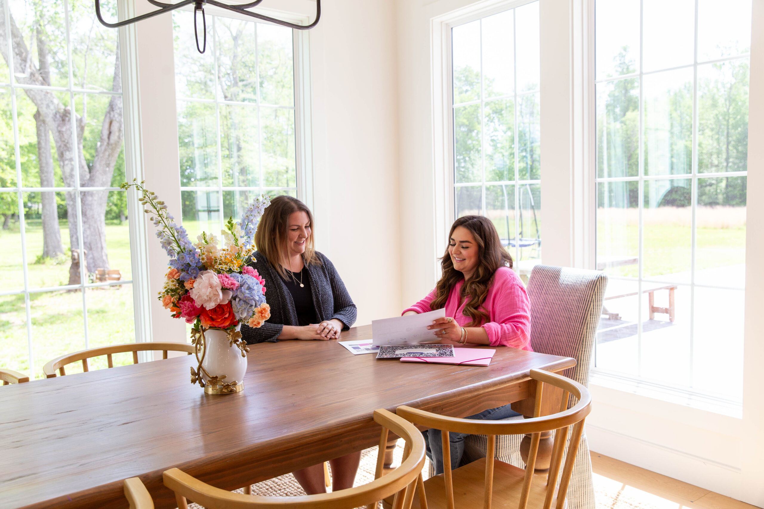
High-quality, on-brand photography makes such a difference to how a website looks and feels. When someone can see real photos of you, in your element, doing your thing, looking like the capable professional you absolutely are, it builds a connection that stock photos simply cannot replicate.
Your photos should feel consistent with your brand’s overall vibe. If your brand is clean and modern, your photography should feel that way too. If your brand is warm and organic, your photos should reflect that. Everything working together creates that cohesive “she has her stuff together” feeling that makes potential clients want to trust you with their business.
I know brand photography feels like a big investment, and it is. But it’s also one of the best ones you can make for your website. Good photos are the difference between a site that looks polished and professional and one that feels unfinished no matter how good the design is. We talk about this more in our post on website design before and after with brand photography.
The Truth About DIY Websites
DIY websites absolutely have their place, especially when you’re just starting out and getting something live is more important than getting it perfect. Truly, no judgment here — done beats perfect every single time when you’re in the early stages!
But there is a ceiling on DIY. A lot of female entrepreneurs hit it right around the time their business starts to take off. The referrals are coming in, the inquiries are picking up, things are feeling exciting, and then the website loses the sale. Not because the offer isn’t incredible, but because the site was built without the strategy behind it to carry things to the next level.
If your website feels like it’s holding you back from where you want your business to go, that’s not a sign that something is wrong with you or your business. It’s just a sign that you’ve outgrown what you built. And that’s actually a really good problem to have! If you’re wondering whether it might be time to make a move, our post on when to invest in brand identity is a great place to start.
Frequently Asked Questions About Web Design for Female Entrepreneurs
How much does web design for female entrepreneurs typically cost?
It really depends on what you need! A DIY website template can cost anywhere from a couple hundred dollars to around $500 and gives you a beautiful starting point you can customize yourself. A fully custom brand and website design, like what we do at Makena Creative, is a bigger investment that starts at $6,500 and includes strategy, design, copy, and launch support. The right choice depends on where you are in your business and what you need your website to do. Not sure which is right for you? Book a free connection call and we’ll figure it out together!
Do I need a professional designer or can I DIY my website?
Both are totally valid options depending on your stage of business! If you’re brand new and working with a limited budget, a well-designed template is a great way to get something professional live without breaking the bank. If you’ve been in business for a while and your website is costing you clients, it might be time to bring in a professional. We offer both options at Makena Creative — check out our templates or learn about our custom design services.
What platform is best for female entrepreneurs building a website?
We are big fans of Showit over here! It’s a drag-and-drop website builder that gives you beautiful design flexibility without needing to know a single line of code. It’s especially popular with service-based businesses and creative entrepreneurs because it’s visually stunning AND it plays nicely with WordPress for blogging and SEO. Curious? Check out our Showit templates to see what’s possible!
How long does it take to build a website?
For a custom brand and website project with Makena Creative, most projects are completed within six to eight weeks from start to launch. For a DIY template, you can often get something live in a weekend if you come prepared with your copy and photos. Either way, the best time to start is right now — the sooner you get the right website live, the sooner it starts working for you!
What’s the most important page on my website?
Your homepage is your first impression, but honestly your About page gives it a real run for its money. It’s consistently one of the most visited pages on service-based business websites because potential clients want to know who they’re working with before they commit. Make sure yours is doing its job! We have lots more to say about this on the blog, so stay tuned.
Ready to See Where Your Website Actually Stands?
If you’re not sure whether your website is doing its job right now, the best place to start is my free Website Gut Check! It’s a 10-point checklist that walks you through exactly what your site needs to close more clients, no tech degree required, no overwhelm, just clear and simple things to look for.
Comment CHECKLIST on our latest Instagram post and I’ll send it straight to your DMs, or grab it right here:
And if you already know deep down that you need more than a few tweaks? That’s exactly what we’re here for at Makena Creative. We’d love to help you build something you’re genuinely proud to share. Book a free connection call here!