Hey hey, friend! Welcome back to another Transformation Thursday! This is honestly one of my favorite things we do around here because getting to show you the behind-the-scenes of a real brand project? So fun. So good. So many feelings.
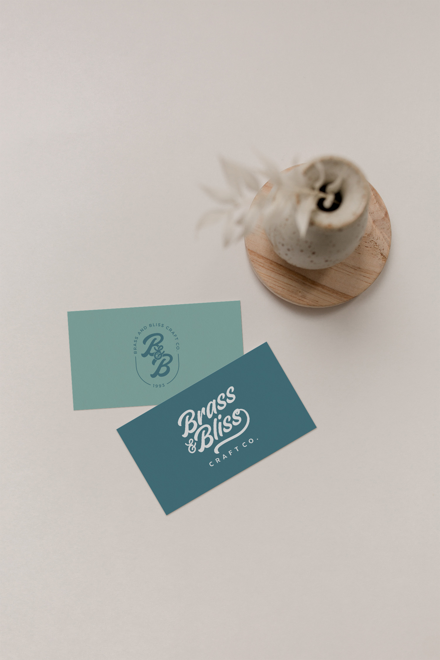
Today we’re talking about Brass and Bliss Craft Co, a craft supply business owned by the wonderful Beth Miller, and honestly this project holds such a special place in my heart. Let me tell you all about it!
A Fresh Start Deserves a Fresh Brand
When Beth came to me, she was stepping into something exciting and a little bit scary all at the same time: a brand new chapter. Brass and Bliss Craft Co was starting fresh, and with a new beginning came a really important question: what does this brand actually look and feel like?
Beth needed more than just a logo. She needed a full brand identity that could carry her business forward, show up cohesively at craft shows and expos, and attract exactly the right customers without pigeonholing her into a corner. And that is exactly what we set out to build together!
What Brass and Bliss Craft Co Actually Needed
Brass and Bliss Craft Co specializes in rubber stamps and crafting supplies for scrapbookers and paper crafters. If you know anything about that world, you know it is passionate, creative, and deeply community-driven. The people who love this stuff really LOVE this stuff, and Beth needed a brand that could speak to that community immediately and authentically.
Here’s what we identified right away: the brand needed to feel modern and fresh without being so trend-forward that it felt out of place in the crafting world. It needed to be warm and inviting without being cutesy. And maybe most importantly, it needed to have enough flexibility to work across a really wide and varied product line without feeling inconsistent or all over the place.
That last piece is actually something I think about a lot with product-based businesses, especially ones with large catalogs. Your brand is like the frame around your whole product line. If the frame is too rigid or too specific, it fights with your products instead of supporting them. If it’s too loose or too generic, it doesn’t do any work for you at all. The sweet spot is a brand that feels cohesive and intentional while still giving your products room to breathe. That was the goal for Brass and Bliss!
The Process: Finding the Right Direction Together
One of my favorite parts of working with Beth was the discovery process, because it’s where so much of the magic actually happens.
When we started exploring style directions in the initial questionnaire phase, we looked at a range of options, including some vintage-inspired aesthetics that felt like a natural fit on the surface. And honestly? Vintage has a lot of appeal in the crafting world. There’s a real nostalgia and warmth to it that resonates with a lot of crafters.
But here’s the thing I kept coming back to: the brand needed to match the product line. Not just feel nice in the abstract, but actually reflect what someone would see in the booth at a scrapbooking expo. If a potential customer was drawn in by the sign and then looked at the products on the table, those two things needed to feel like they belonged together. That coherence is what builds trust and recognition, and it’s what makes people stop, look, and buy.
So we pushed past the first instinct and kept exploring until we landed on something that felt undeniably right: modern, clean, warm, and just the right amount of personality. Something that could grow with the business, flex across a huge product range, and show up consistently whether Brass and Bliss was at a big craft expo or popping up in someone’s Instagram feed.
The Result: A Brand That Actually Fits
The finished brand for Brass and Bliss Craft Co is one of those projects where everything just clicked. And I i don’t say that about every project because every project has its twists and turns, that’s just the nature of the creative process! But this one really did come together beautifully.
The color palette is warm and modern without feeling trendy. The typography has personality without being fussy. The overall vibe is the kind of thing that makes you stop at a craft show booth and think “ooh, what is this?” before you’ve even read a single word.
And the flexibility piece? Nailed it. The brand system works across rubber stamps, packaging, signage, social media, and everything in between without feeling stretched or inconsistent. Beth can add new products, try new things, and show up in new places without ever feeling like her brand can’t keep up.
That’s what a really good brand identity is supposed to do. It’s supposed to grow with you, work for you, and feel like YOU even as your business evolves.
What Beth Had to Say
Beth was such a joy to work with from start to finish, and hearing her feedback at the end of the project was genuinely one of those moments that reminds me exactly why I do this work.
She described the experience as wonderful from start to finish and said she loved how the questionnaire process helped her get clarity not just on the visuals but on the business itself. That is honestly the goal every single time: to help you see your own business more clearly through the process of building your brand.
Wonderful from start to finish. I appreciated the thorough questionnaire because it made me think of things I wouldn’t have typically considered and helped me hone in on the voice of my brand. I like the workflow, the ease of communication, the tools that were given to us, and Makena’s ability to listen.
What This Project Taught Me (And What It Means for You)
Working with Brass and Bliss reinforced something I come back to over and over again with product-based businesses: your brand is not just a logo. It’s a system. It’s the thing that makes every single touchpoint in your business feel connected and intentional, from your booth at a craft expo to your packaging to your Instagram grid to your website.
And the most important thing that system can do? Match what you actually sell. Not what you wish you sold, not what looked cool on Pinterest, but what a customer is going to find when she walks into your world. Alignment between your brand and your products is what creates trust. And trust is what creates sales.
If you’re a product-based business owner thinking about your brand identity, or honestly any small business owner who’s been wondering whether your visual identity is actually working for you, this is your sign to take a closer look. A boutique branding agency experience like this one isn’t just about making things pretty. It’s about building something strategic that works as hard as you do.
Ready to Build a Brand That Actually Fits Your Business?
If the Brass and Bliss story resonated with you and you’re thinking “okay, I think I need this for my business,” I would love to chat! At Makena Creative, we work with small business owners and female entrepreneurs to build brand identities that are strategic, cohesive, and built to grow with you.
Book a free connection call here and let’s talk about what’s possible for your brand!
And if you want to learn more about what goes into a strong brand identity before we talk, check out these posts:
What Is a Brand Identity and Why Does It Matter?
Web Design for Female Entrepreneurs: What You Actually Need to Know
The 3 Game-Changing Components for an Epic Website
Or grab the free Website Gut Check to see where your online presence stands right now! Comment CHECKLIST on our latest Instagram post and I’ll send it straight to your DMs, or grab it here: