A Southern-Inspired Brand with a Fresh Perspective
Some brand projects feel like a deep breath and a sweet breeze—and this one was just that.
When Kellie Walton came to me with her vision for Modern South, I knew we were about to create something special. Her business blends thoughtful southern storytelling with modern flair. Through online publications, food reviews, and restaurant features, she’s curating a space that honors tradition while looking forward. And her brand? It needed to do the same.

Designing a Southern Legacy
From day one, Kellie knew she wanted her brand to feel distinctly southern—but not in a cliché or outdated way. She threw out ideas like toile, monograms, and southern motifs, and we began working through what would feel most aligned with the modern side of her message.
A full hand-drawn toile pattern was a bit too much for a primary logo, so we found creative ways to nod to that traditional feel in other visual elements.
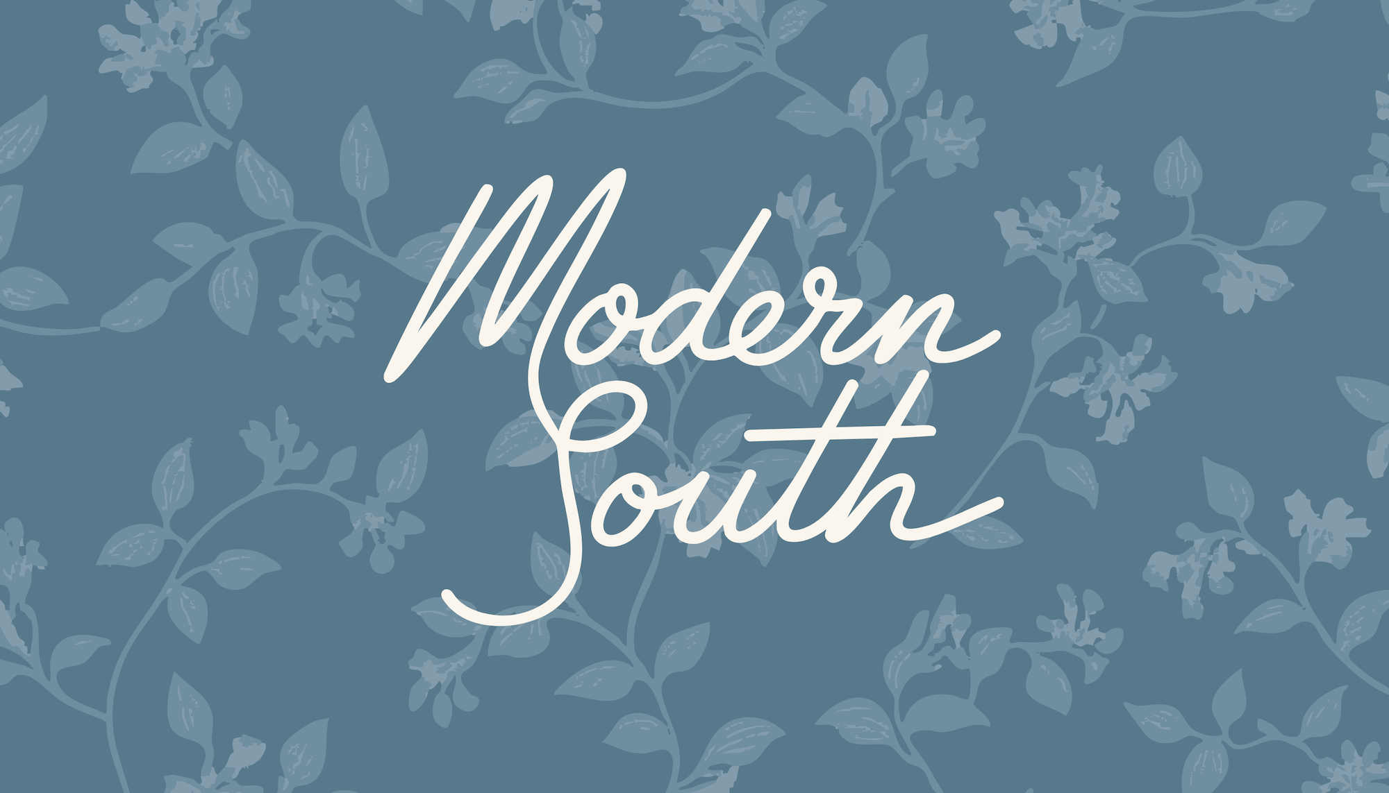
And then… came the honeysuckle.
The Honeysuckle Moment
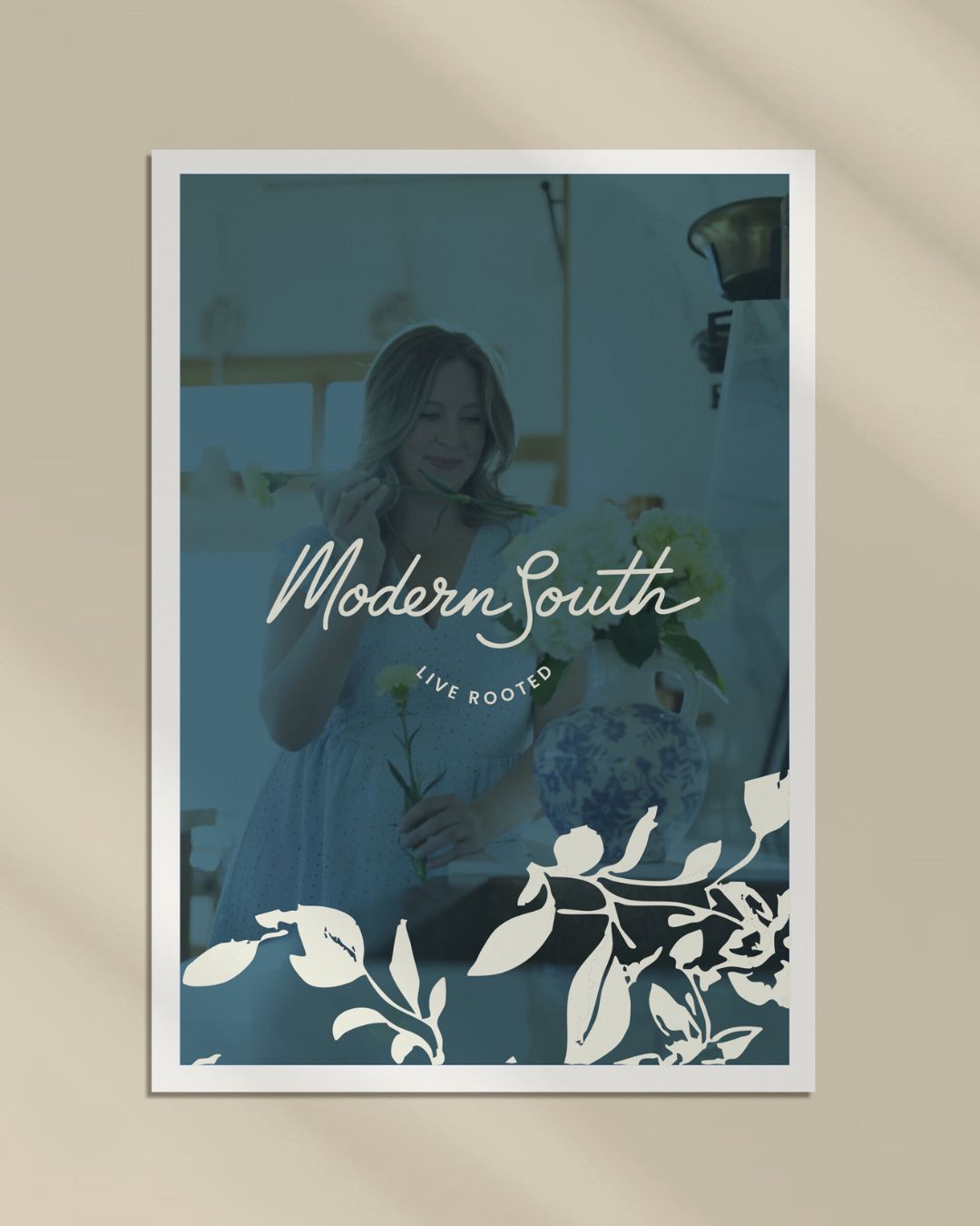
There’s always a turning point in every project—and for this one, it happened when I casually said the word honeysuckle. Kellie’s eyes lit up. That was it. That was her symbol.
It was feminine but not frilly. Southern without being stereotypical. Bold enough to stand alone, but delicate enough to pair with editorial layouts.
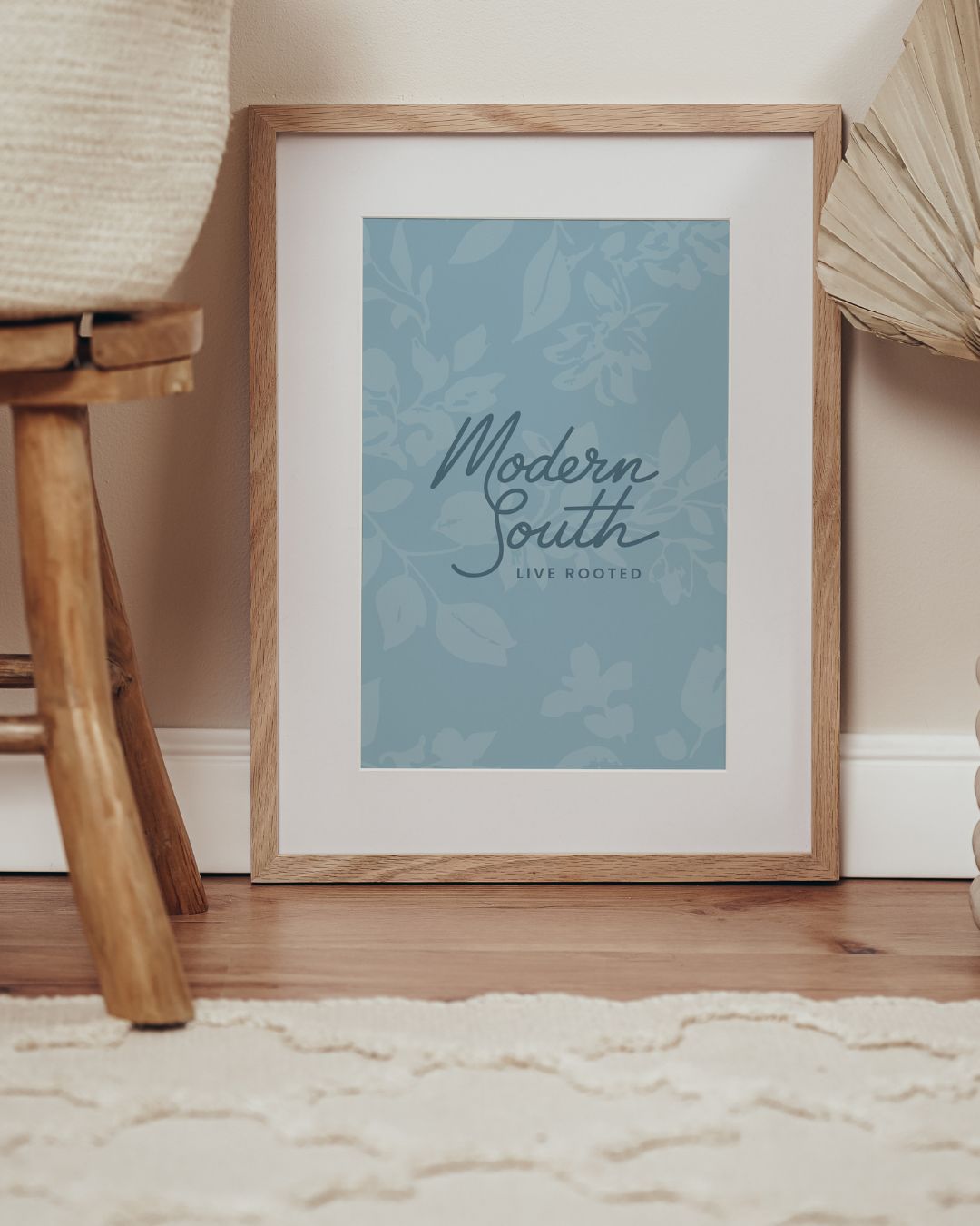
So, we did what we do best—we designed a completely custom honeysuckle motif just for Modern South. It now lives in her logo suite, across her brand assets, and in the heart of her story.

Balancing Tradition and Edge
The Modern South brand needed to walk a fine line: honoring southern roots while staying forward-thinking and editorial. We accomplished this through:
- A timeless color palette with soft neutrals and rich accents
- Refined serif typography mixed with clean modern lines
- Subtle nods to southern culture through layout, illustration, and brand copy
The end result is a brand that feels established and intentional—like a well-worn porch swing that’s been repainted for a new season.

Why This Brand Works
What makes Modern South feel different is its authenticity. Kellie’s audience isn’t just there for food reviews or pretty content—they’re there for the feeling. That warmth. That southern hospitality. That wink of nostalgia with a modern edge.
And now, her brand matches that energy—subtle, confident, and full of story.

Want a Brand with Meaning?
If you’re sitting on a vision that feels deep and personal, but your current brand doesn’t quite capture it—this is your sign. Let’s create something beautiful and strategic together.
→ Head over to Instagram to see more behind-the-scenes photos from this project
→ Or click here to start your own brand journey