Let me say something that I wish more designers said out loud.
A brand refresh is not an admission that you got it wrong the first time. It is proof that your business is alive enough to have learned something.
The best brands I’ve ever worked on are not the ones that launched perfectly and never changed. They’re the ones that launched honestly, grew intentionally, and eventually came back to the drawing board with four years of real experience and said: okay. Now we know what we actually are. Let’s build something that says so.
The Sapphire Suite’s 2026 brand refresh is one of the clearest examples of this I have ever been a part of. And I want to walk you through exactly what we changed, why we changed it, and what it means for you if you’re sitting right now with a brand that stopped feeling like yours somewhere along the way.
What the Original Brand Was Built On
If you read the first two posts in this series, you already know the origin story. But for the newcomers: The Sapphire Suite launched in 2021 as a women-only co-working space in Franklin, Tennessee, and Tammie Osborne hired me to build the brand before the space had opened its doors.
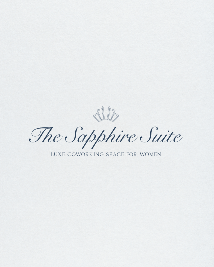
The original brand was rooted in a very specific vision: feminine royalty. Think deep navy, beige, sage green, jewel tones, and a crown icon that tied the whole thing back to the Princess Diana naming inspiration we landed on after rejecting both Diana’s Place and The Crown Room. It was intentional. It was cohesive. It was exactly what a pre-launch brand in that vibe needed to be.
The crown icon in particular was meaningful and memorable. It showed up everywhere, on graphics, on signage, woven into the identity in ways that felt both elegant and distinctive. Tammie loved it. The members loved it. It became part of the visual shorthand for the space itself.
And it still lives in the physical space today. Walk into The Sapphire Suite and you will see the crown. It has not been erased. It has simply been retired from its role as the primary spokesperson for the brand.
There is a difference.
What Four Years of Running the Business Revealed
Here is what nobody tells you when you’re building a pre-launch brand: the business you imagined and the business you actually build are almost never exactly the same thing. Sometimes they’re close. Sometimes they’re wildly different. And sometimes they’re better than you imagined, which is the best possible problem to have.
The Sapphire Suite fell into that last category.
Four years of events and community and real women showing up every week had given the brand something the original design could not have anticipated: a personality that was warmer, more modern, and broader than the original brand was communicating. The original brand said feminine royalty. The actual business was saying something more like: vibrant, welcoming, current, and deeply human.
That’s not a failure of the original brand. That’s just what growth looks like.
A few specific things had become clear by the time Tammie and I sat down to talk about a refresh.
The crown icon, while beloved, was pulling focus in a direction that no longer matched the day-to-day feel of the space. It carried a formality that the community itself had outgrown. The women who showed up to BizBrews on a Tuesday morning were not looking for a crown. They were looking for connection, and the brand needed to lead with that.
The color palette, while genuinely beautiful, had become limiting in practical applications. Deep beiges and sage greens and moody navy are stunning in a brand guide. They are significantly less stunning when you’re trying to make a social media graphic that stops someone mid-scroll or a piece of event signage that reads clearly from across a room. The palette was working against the team in the day-to-day, and that is always a sign that something needs to shift.
The overall feel was skewing a little older and a little heavier than the actual energy of the space. The Sapphire Suite in 2026 is bright and energetic and full of women at various stages of building something exciting. The brand had some catching up to do.
What We Actually Changed
This is the part where I get to be a designer for a minute, so bear with me because I think this is genuinely interesting.
The Color Palette
The 2026 palette is more alive than the 2021 version, and I mean that in the most specific possible way.
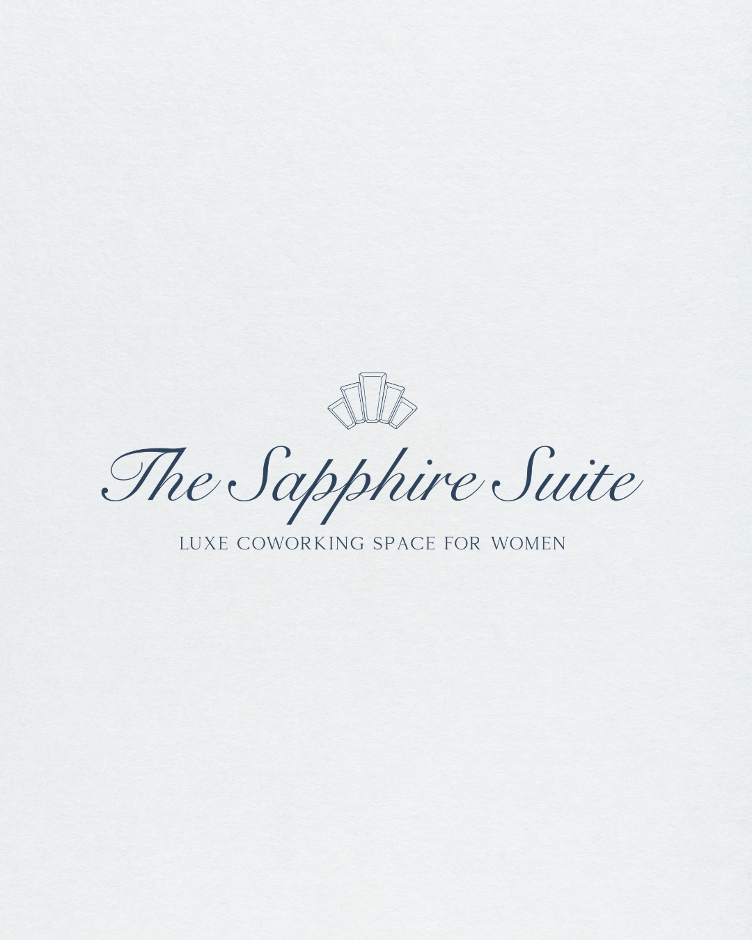
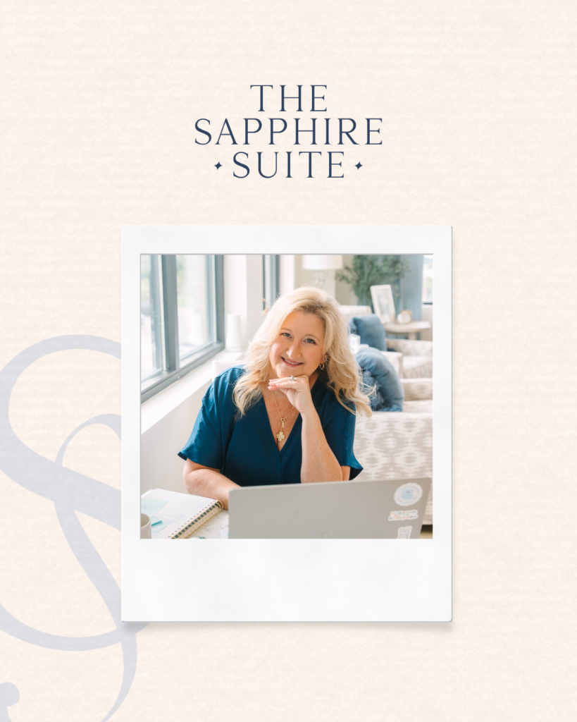
We moved away from the beiges, sage green, and deep navy that anchored the original brand and into something with more contrast and more energy. The new palette is built around a richer, more saturated navy as the foundation, paired with a pale blue that Tammie and I pulled directly from the kitchen tile in the actual space. That detail matters to me more than it probably should. The brand color literally exists inside the physical space. It’s specific and grounded and completely theirs.
The brighter accent blue we added gives the palette something to work with on social media and in event graphics: a color that pops, that draws the eye, that says something is happening here without screaming it. More contrast. More versatility. More room to build on in the everyday.
The Crown Icon
This one required some careful thinking, because the crown icon carries real meaning for Tammie and for the community. We were not going to just delete it and pretend it never happened.
What we did instead was step it back. The crown is still present in the physical space. It still shows up in context. But it is no longer the hero of the brand identity. The wordmark and the overall brand system do the heavy lifting now, which gives the brand more flexibility and a slightly more modern, less formal feeling without losing the origin story entirely.
Think of it less as elimination and more as evolution. The crown went from lead actor to supporting character. It is still in the story. It just doesn’t carry every scene anymore.
The Overall Feel
The best way I can describe the shift is this: the 2021 brand felt like an invitation to something aspirational. The 2026 brand feels like you are already there.
Fresher. More youthful. More contrast. Easier to build on in the day-to-day without every graphic looking like it came from the same deep, moody well. The brand now has range, which is something a growing, active, community-driven business genuinely needs.
Wondering what your own brand is actually made of?
The Anatomy of a Perfect Brand is our free guide that walks you through every element of a strong brand identity, from color palette to logo to brand voice, so you can see exactly what yours might be missing.
Comment PERFECT BRAND on our latest Instagram post and we’ll send it straight to your DMs. ✨
The Business Lesson That Every Brand Owner Needs to Hear
I want to talk directly to anyone reading this who has a brand that used to feel right and doesn’t anymore.
Your brand is not a time capsule. It was never supposed to be frozen at the moment you launched it and preserved forever as a monument to who you were in your first year of business. It is a living thing. It is allowed to grow. In fact, it is supposed to grow.
A refresh is not a rebrand. This distinction matters and I want to make sure it lands. A rebrand means you are starting over: new name, new direction, new identity, often because the business itself has fundamentally changed. A refresh means you are refining what you already have, tightening it up, updating it to reflect where the business actually is right now rather than where it was when you first opened the doors.
The Sapphire Suite did not rebrand. The Sapphire Suite is still The Sapphire Suite. The name is the same. The purpose is the same. The community is the same. What changed was the visual expression of all of that, updated to reflect four years of actual lived experience rather than a pre-launch mood board.
That is a very different thing, and it’s important to understand the difference before you decide which one your business needs.
Here is how to know when it’s time for a refresh. You find yourself apologizing for your brand to new people. You say things like “the website is a work in progress” or “I know it doesn’t totally reflect what we do now” or you hesitate before handing someone your business card. You avoid sharing your own links. Your graphics feel like they’re fighting your palette instead of working with it. Any one of these is a signal. All of them together means you should have called me six months ago.
The best time for a refresh is not when your brand has completely fallen apart. It’s when you notice the early signs that it has stopped growing with you. Catch it early. Give your brand room to evolve before it becomes an embarrassment instead of an asset.
Ready to Talk About Your Brand?
If you have been nodding along to this post in a way that feels a little too personal, that is information worth acting on.
As a nashville branding agency, Makena Creative works with business owners who are ready to close the gap between what their brand currently says and what their business actually is. Whether you need a full brand and website build from scratch, a strategic refresh of an existing identity, or just a conversation to figure out which one you actually need, we would love to be in that room with you.
Every project starts with strategy. Every decision we make is rooted in who your audience is, what you want them to feel, and what your business has actually become. We do not guess. We listen first.
Here’s how to take the next step:
Not sure what your brand is missing? Comment PERFECT BRAND on our latest Instagram post and grab the free Anatomy of a Perfect Brand guide. It’s a good starting point.
Want to see what brand refreshes and full rebrands look like in practice? Explore the portfolio →
Ready to have the actual conversation? Book a connection call →
And if you’re in the Nashville area and curious what a brand that got its refresh right looks like in person, go visit The Sapphire Suite: thesapphiresuite.com. The coffee is good, the community is better, and the brand is looking pretty great these days.
xo, Makena
Frequently Asked Questions
What is the difference between a brand refresh and a full rebrand?
A brand refresh updates and refines your existing identity without changing the fundamental direction of your business. You keep your name, your core positioning, and the essential elements of your brand, but you update the visual system to better reflect where the business is today. A full rebrand is a more significant undertaking, typically warranted when the business itself has changed direction, pivoted to a new audience, or needs to completely distance itself from its previous positioning. Most businesses need a refresh far more often than they need a full rebrand, and knowing the difference can save you significant time and money.
How often should I refresh my brand?
There is no universal timeline, but most brands benefit from a strategic review every three to five years. The more important signals to watch for are the behavioral ones: are you avoiding sending people to your website, apologizing for your logo, or struggling to make your brand work practically in graphics and social media? Those are stronger indicators than any calendar date.
What does a brand refresh typically include?
A brand refresh at Makena Creative typically includes a strategy session to identify what is and isn’t working, updates to the color palette and typography, revisions to the logo system, and a refreshed brand style guide. Depending on the scope, it may also include a website redesign to bring the full brand expression into alignment. Every refresh is different because every business is different.
Do I have to start completely over if my brand isn’t working?
Almost never. In most cases, the issue is not that the brand is wrong from the ground up, it’s that it has stopped evolving with the business. A good nashville branding agency will help you identify exactly which elements to keep, which to refine, and which to let go, rather than wiping the slate clean unnecessarily. The goal is always to preserve equity where it exists and update where it doesn’t.
How long does a brand refresh take?
A brand refresh is typically faster than a full brand build. At Makena Creative, refresh projects generally run four to six weeks depending on scope and asset availability. A full brand and website project runs eight to twelve weeks. We’ll give you a clear timeline at the start of the project so there are no surprises.